Mapeo has proven to be a popular and powerful tool for communities to collaborate, to gather and analyze environmental and human rights data. It has proven easy-to-learn and use, accessible even to people who have never touched a laptop or cell phone before. However, the peer-to-peer model of data synchronization between devices is a common pain point for communities: it is not always clear what is happening during synchronization, how long it will take, and occasional errors and failures can erode trust and confidence.
In this blog post, we share thoughts from our Lead UX Designer & Senior Backend developer on how we are working to improve peer-to-peer sync, beginning with our plan to revamp the UX experience for synchronizing the peer-to-peer database in Mapeo. The UX improvements will require additional functionality on the backend, such as better progress and sync status information so that users can clearly see which devices they have synced with and are up-to-date with. Take a look at how we address the technical and design challenges we are facing, and the possible solutions we are considering.
UX process from Lead UX Designer – Sabella Flagg :
Sync is a core function of the Mapeo app and with that comes special consideration not only to how current partners use it, but what new partners might expect from it. Additionally, technical advancements open up the possibility for sync to function in new ways.
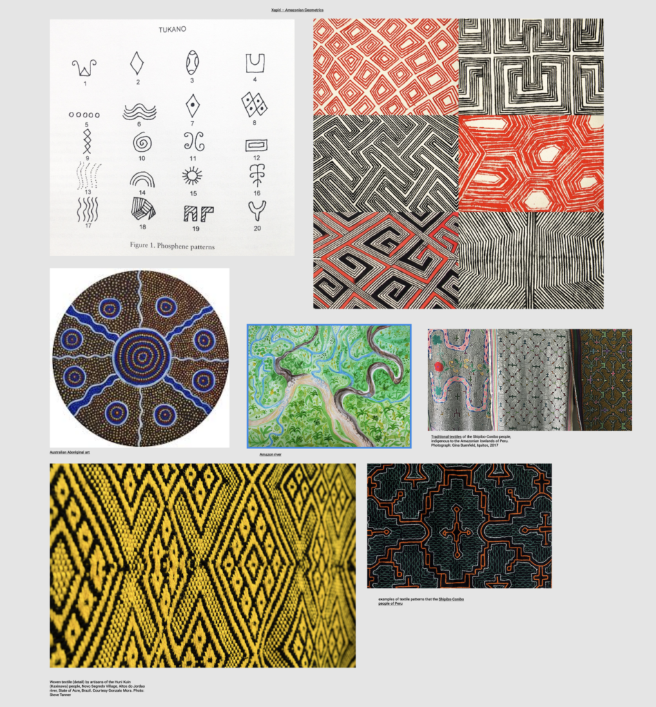
With these considerations in mind I revisited previous conversations with the Programs team members where we ended up talking about indigenous art and cartography during a brainstorm about Sync; throughout the year I found myself collecting examples of indigenous art and patterns for inspiration and working to figure out how to incorporate aspects of them into Sync.
The first thing I like to do at the start of a large project is to world build: laying out what is possible in the world that this feature was built for. This is an important step because oftentimes we are designing for versions of the app that don’t exist yet or are currently in development. So it is important to know, not only the type of user we are designing for but also the parameters of what is going to be technically possible.
The Programs team had also requested a way to better show connections between devices and how they relate to each other which is where I incorporated my art based inspiration and created a concept referencing the movement of air pockets in moving water.
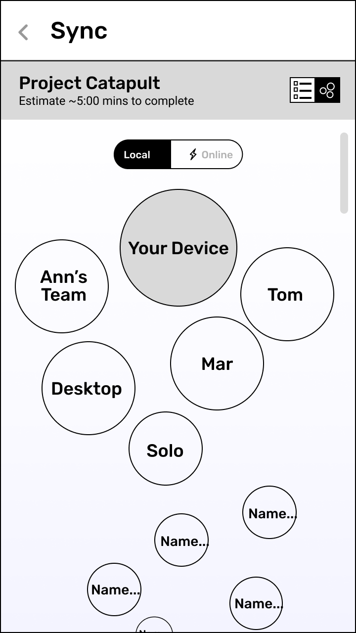
Each device would be shown in proximity to your device with the closest and largest ones being devices I’d synced with more often. I also had to keep in mind that a device I had not synced with may appear close to me because in the decentralized network I may have received data from that device through other devices. The smaller and further away a device was shown the less data to be transferred between the two. The goal of this is to create an at a glance visualization of myself in relation to other project devices. It purposely does not have many actions to be taken as it is not intended to be where a user goes for utility.
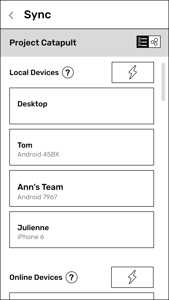
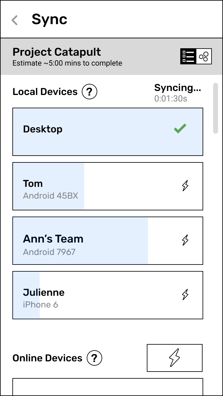
For that, I returned to a list view, which we know to be a stock and stable ui for relaying information, but with additions! A few iterations in and we landed on a list view that separated local from online devices. Instead of syncing indiscriminately between the two, users could control when or if they synced with online devices at all, since there potentially could be a cost to doing so. Unavailable devices are listed at the very bottom and may be unavailable for a myriad of reasons; they might not be online or on the same network as me or they may have been removed from the project.
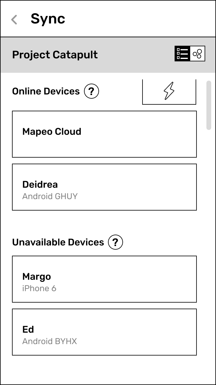

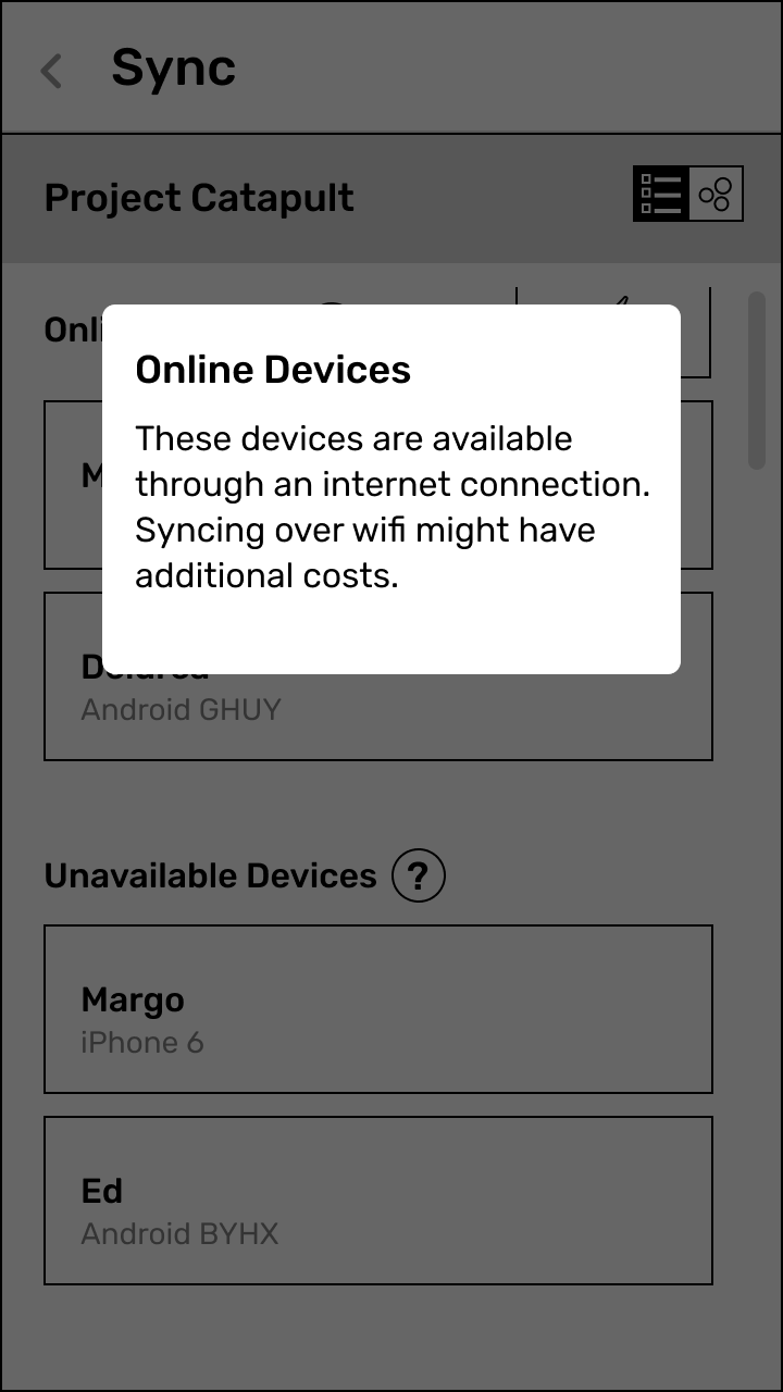
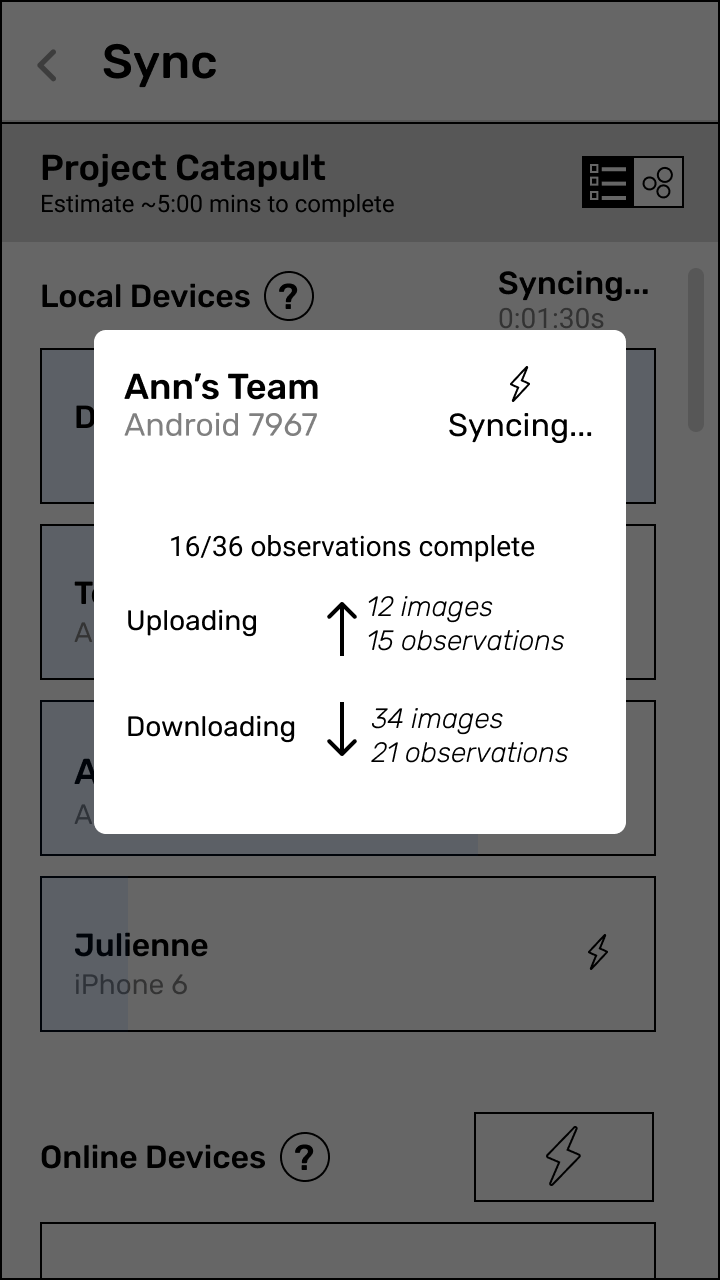
Finally I added a new state while syncing that uses the list view to show the progress of data being transferred. Tapping a list item surfaces a breakdown of what’s being transferred between both devices. These two views combined also touch on a personal design goal of adding more instances of visual interest, engaging fun while not losing functionality and staying welcoming.
Sync implementation process from Senior Backend Developer – Seth Vincent
Synchronizing data between peers starts with discovery of peer devices. In our new sync implementation there are two methods of discovery: over local networks using multicast DNS and over the web using the [hyperswarm DHT](https://github.com/hyperswarm/). This makes it possible to support a wide range of use cases including: offline local network sync, sync between peers with internet access over large distances, and “backup” sync to cloud-based peers that can be deployed and managed by project coordinators.
Mapeo Core (the peer-to-peer database that powers Mapeo) now includes a class called AuthStore, an approach for authorizing the access and capabilities a device has in a project. This is an important part of syncing data in Mapeo because the AuthStore data is synced first, then a device’s access and capabilities are verified before moving on to syncing other data.
After authorization, sync continues with observation data (and in the future other JSON-serializable data). Finally, media data such as images is synced last. The ordering of observation data before media data helps to mitigate against filling up device storage with large files before observation data has had a chance to complete.
Some additional improvements:
- Progress status of sync is improved so that users have a better sense of what data is syncing, and when
- Data encoding has been improved using Protocol Buffers to reduce storage & bandwidth usage
- More strict data schemas are in use to reduce missing/malformed data issues
- Syncing with a self-hosted Mapeo Cloud server will make it possible to store data online long-term as a way to backup data
- We’re designing other approaches for reducing storage usage including selective mobile sync that excludes original image files after they’ve been saved to a desktop
***
Once we finalize our UX design explorations and wrap up our Mapeo Core upgrade, we will be able to develop and deploy a redesigned sync experience in Mapeo that is reliable and easy to understand. This will enable communities around the world — existing and new Mapeo users — to have greater control and stewardship over data that they gather, and increase their trust in how data is being stored and how it is being shared.
***
Mapeo is an open source software that benefits from continued feedback from our users across the world.
Suggestions? We would love to hear from you.
Email us at support@mapeo.app
You can also find us on Discord!
- Read more about Mapeo and download it at https://mapeo.app
- Mapeo Mobile for Android is available on the Google Play Store
Mapeo Mobile is also available for install by downloading the Android APK